
The stock market, commodity markets and fixed-income markets have been on some wild rides the past 18 months. We penned 2021 forecast pieces back in January (read here and here), but a fresh look at things for the balance of the year seems like a good idea with commodity plays on the rise, oil prices coming on strong while other areas of the market are cooling.
Let’s start our analysis with some monthly candlestick charts.
Candlestick Analysis
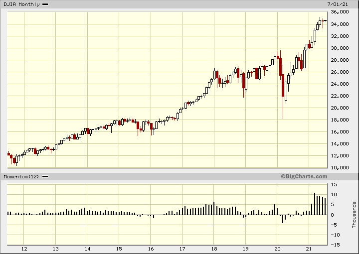
Dow Jones Industrials
In this monthly Japanese candlestick chart of the Dow Jones Industrial Average (DJIA), below, we can see that prices have made a huge rise over the past decade and a very sharp advance since March of 2020. Taking a little liberty in our methodology we can see an 8 to 10 record high advance since the 2020 pandemic low. Notice the slowing pace of the 12-month price momentum study in the lower panel.
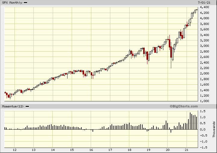
S&P 500
In this monthly Japanese candlestick chart of the S&P 500 Index (SPX) below, we can see another big advance over the past 10 years. The index made a sideways consolidation pattern in 2015-2016 around 2,000 to 2,200 and we have for most part doubled from there. I would not be surprised to see some significant profit-taking as the SPX approached 4,400. Momentum has been slowing here too.
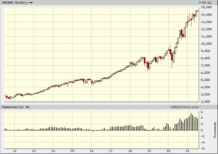
Nasdaq
In this monthly Japanese candlestick chart of the Nasdaq, below, we can see that prices have doubled from their consolidation pattern in 2018 and 2019 in the 7,000 area. Prices have nearly tripled from their consolidation around 5,000 in 2015-2016. Yes, the momentum study is slowing.
Russell 2000
In this monthly candlestick chart of the Russell 2000 index (RUT) we can see that prices have more than doubled from their March 2020 low. This could take your breath away. With the string of white candles and weakening momentum we want to be more cautious as we move forward in the third quarter.
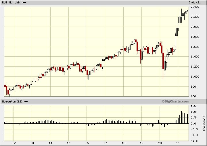
All these charts (above) show the 8 to 10 record high pattern so we should be on our guard for a top reversal pattern.
Advance-Decline Analysis
Now, let’s turn our attention to the Advance-Decline line.
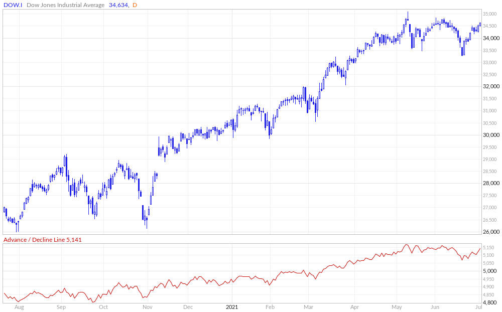
Dow Jones Industrials
In this daily candlestick chart of the DJIA, below, we show the Advance-Decline line which has been moving sideways since early May. This difference between the price action is a bearish divergence but the DJIA is a narrow average with only 30 stocks.
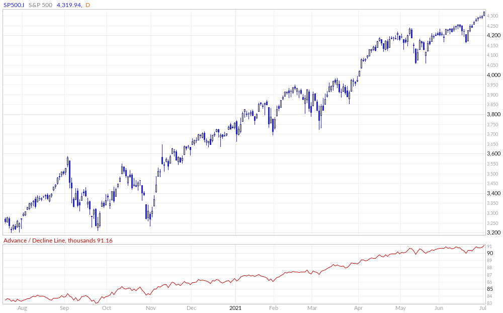
S&P 500
In this chart of the S&P 500 and its Advance-Decline line, below, we can see that prices and the Advance-Decline line are pointed up so a bearish divergence has not started.
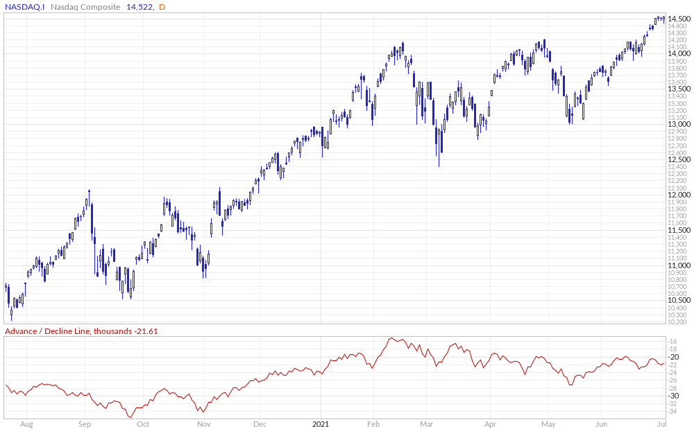
Nasdaq
In this chart of the Nasdaq, below, we can see a significant bearish divergence. The Nasdaq has been making new highs but the Advance-Decline line has been moving sideways to lower from February.
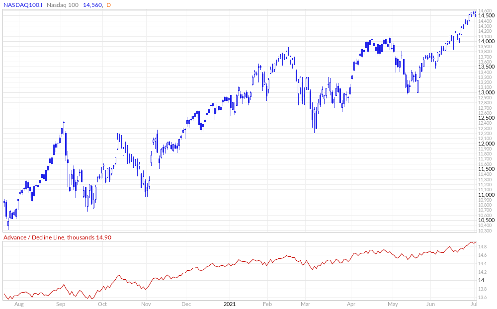
Nasdaq 100
In this chart of Nasdaq 100 and its Advance-Decline line, below, we see prices and the indicator going up together. No bearish divergence here.
Sectors
The marketplace can be broken down into 11 sectors but I want to cover just part of the list today.
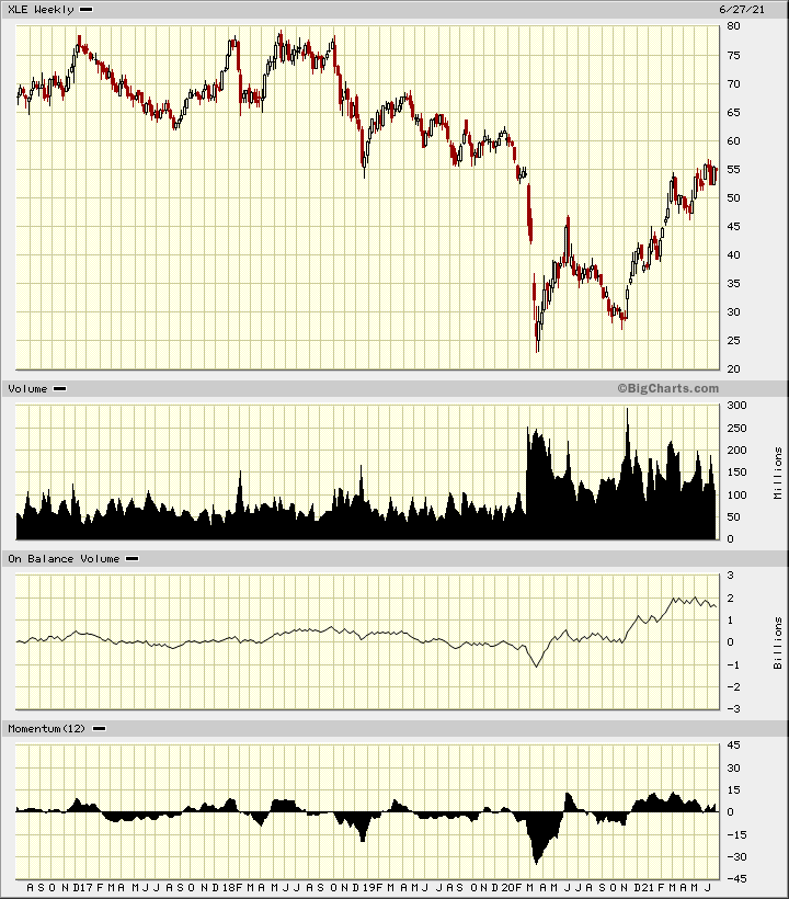
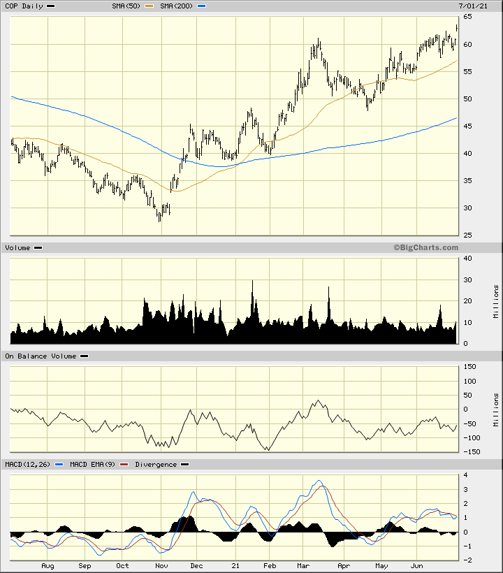
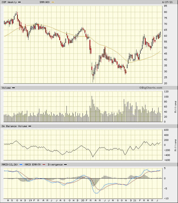
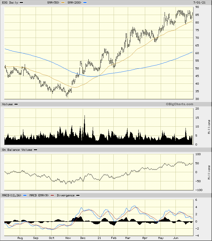
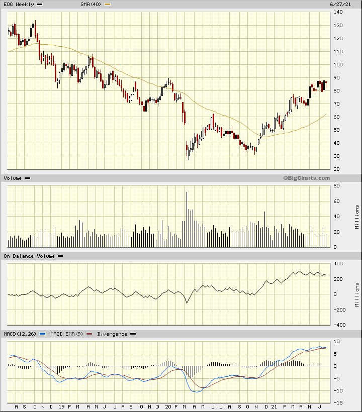
Energy
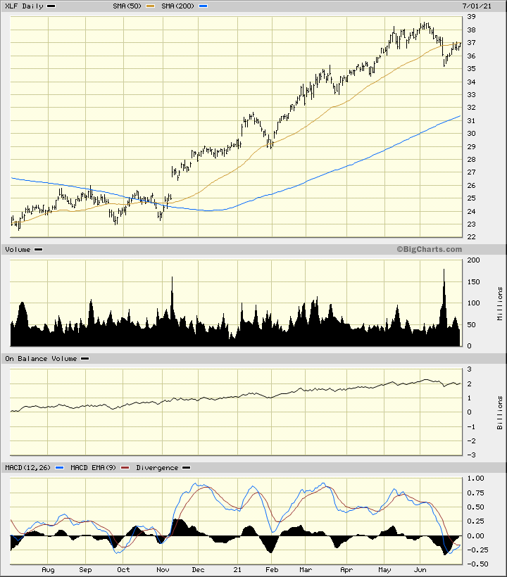
Financials
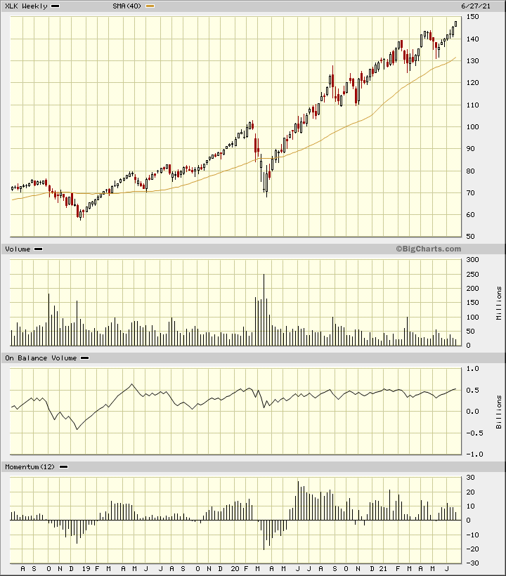
Technology
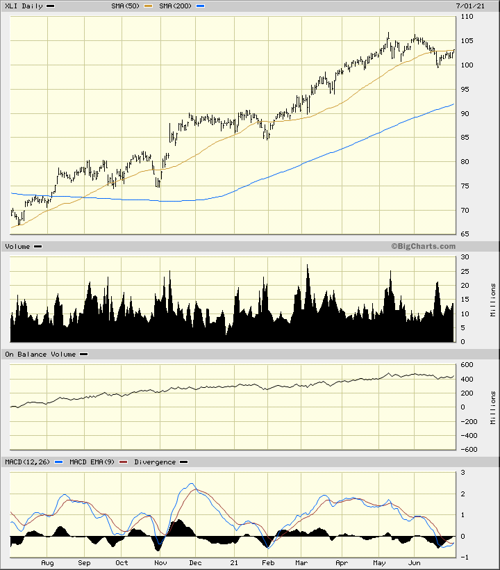
Industrials
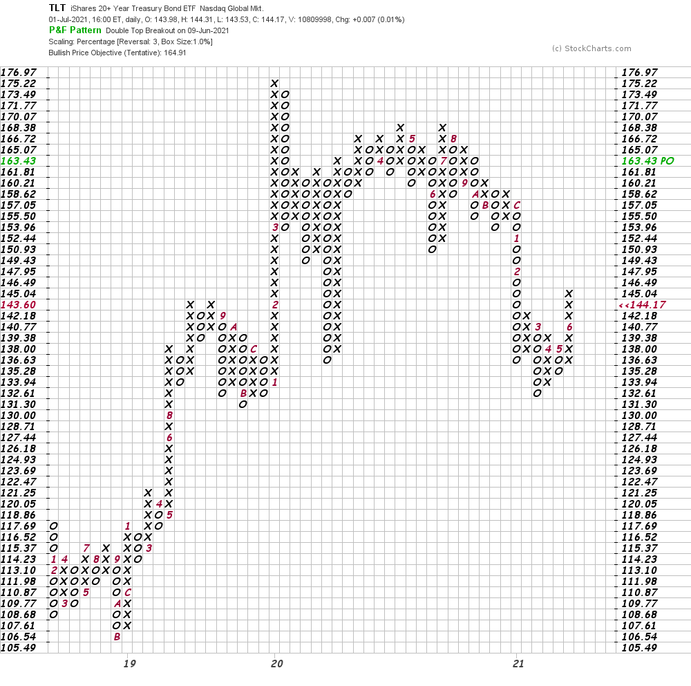
Bonds
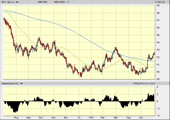
U.S. Dollar
In this daily Japanese candlestick chart of the U.S. Dollar Index (DXY) we can see that prices have stopped short of a test of its late March/early April highs. DXY could make a slow drift downward to retest its May lows.
Mark Your Calendars
Sentiment
No discussion about the stock market would be complete without some discussion of sentiment. There are plenty of “signs” of the stock market being out over its skis.
I see a number of market letters and commentary from fellow technical analysts and they are all bullish. I get emails from Real Money subscribers asking about this stock or that stock and I have two observations:
1. The names they are asking about seem to be more speculative in nature. I cannot remember the last time someone emailed me about a boring utility stock.
2. The second thing that has struck me about the emails is the failure to recognize risk. Everyone wants to know the next highest price target but they never ask about where to move a stop up.
Sentiment is not a precise indicator and much of it is anecdotal in nature and hard to quantify. The anticipated Robinhood IPO could mark a turning point.
Bottom-Line Strategy
The stock market has given us some incredible returns in the past year or two but there are some warning signs developing and traders need to start leaning in the other direction.
Consider adding to commodity plays as they could be the outperformers of the third quarter.
Consider becoming a scale-up profit taker. Continue to raise your stop protection to lock in more gains. Pay closer attention to where in the range prices are closing. Highs are typically made when prices close near the high of the day.
Is the On-Balance-Volume line weakening as volume increases on days when the market or your favorite stock declines?
Pay closer attention to the news and watch for stocks and the market to decline on bullish news — this tells us that the news has been discounted.
Do not count on diversification to save the day — there are times when everything goes down.
Get an email alert each time I write an article for Real Money. Click the “+Follow” next to my byline to this article.